How we designed the First Saff logo: what the name means, what we studied, what we tried and threw away, and why the final mark looks exactly the way it does.
Before drawing anything, we started with the words. First Saff is two of them, and together they make a promise.
Saff is Arabic for a row: the straight line worshippers form in prayer, standing shoulder to shoulder and foot to foot, facing the qibla.
The first saff is the front row, closest to the imam and the mihrab. To be in it you have to arrive early. That is the whole idea of the app: know where the nearest masjid is and when the next prayer starts, so you can be there first.
A prayer hall from above. Rows fill from the front: the first saff fills first.
“If people knew what is in the call to prayer and the first row, and found no way to get it but to draw lots, they would draw lots.”
“Straighten your rows, for straightening the rows is part of establishing the prayer.”
Most masjid apps draw a building. Our name is not about a building. It is about being first and about the row. A logo that only says “mosque” would miss the point of the name.
We wrote these down before the first sketch and checked every round against them.
No domes, crescents or mosques in pins. Something truer and quieter.
The name is a promise to be early. The logo should carry the number one.
A saff is a line of people. The mark needs a line in it.
Favicons, notifications, map pins. If it breaks small, it breaks.
Saff Blue, soft corners, calm, Anek Latin. Not a new brand bolted on.
The best marks on the board hide a second meaning. So should ours.
Look at masjid and prayer apps and the same few pictures keep coming back. Our own first icon was one of them.
The five most common pictures in the category, redrawn by us as plain diagrams.
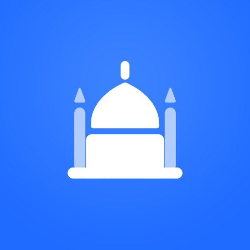
A white dome with two minarets. Clean and friendly, but any masjid app could have it, and it said nothing about the name.
Every one of these says “mosque”. None of them says first, and none shows a row. That empty space is exactly where our name lives, so that is where the logo should live too.
We started from a Pinterest board of logos the team loves. Each one was opened at full size and studied: its shape, its colour, its light, what makes it stick. Here is what we found.
Each reference sorted by what it is. Counts are our own tally.
A pin that is also an arrow. A u that is also a p. A quote mark that is also a D. The mark you remember is the one that rewards a second look.
Most of the icons are one clear silhouette on one flat colour. Nothing competes with the hero.
Soft corners and round ends feel friendly without looking childish, and they survive being shrunk.
A gradient tile, a raised glyph with light on its top edge and a soft shadow under it: depth without realism.
A cool base with one warm accent: the eye goes to the accent first, so it should carry the meaning.
Ghosts, cats, smiles. Charming for games and food, but a place of prayer is not a cartoon.
The references belong to their designers, so we don't reproduce them here. The small drawings are ours and only show the idea. A reference can show more than one pattern.
Nothing here was planned in one go. Each round answered one question, and the answer usually threw something away. These are the real working sheets.
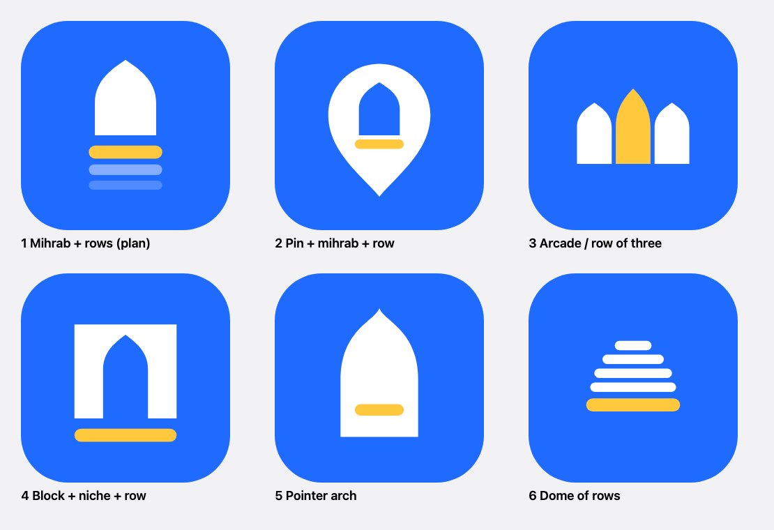
A mihrab with rows, a pin with a mihrab inside, an arcade, a gate, a pointer arch and a dome built from rows.
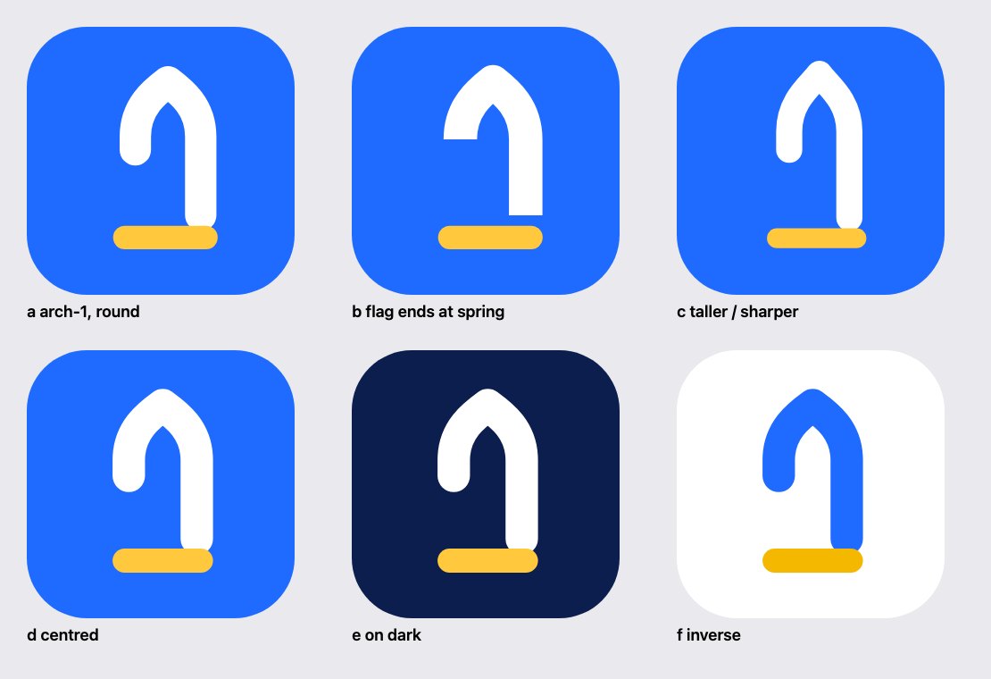
Take a mihrab arch and cut away the lower part of its left leg. What is left could be the number one.
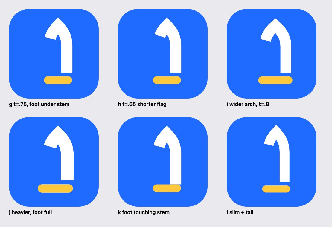
Stop the left curve part of the way down and cut it square to the curve, so the flag points down and to the left like a real numeral.
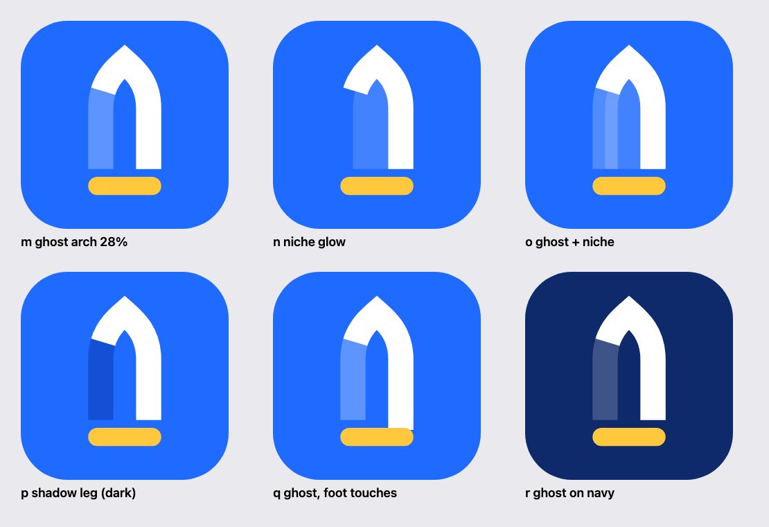
Draw the missing leg again, but faded. The eye completes the arch and still sees the solid 1 in front of it.
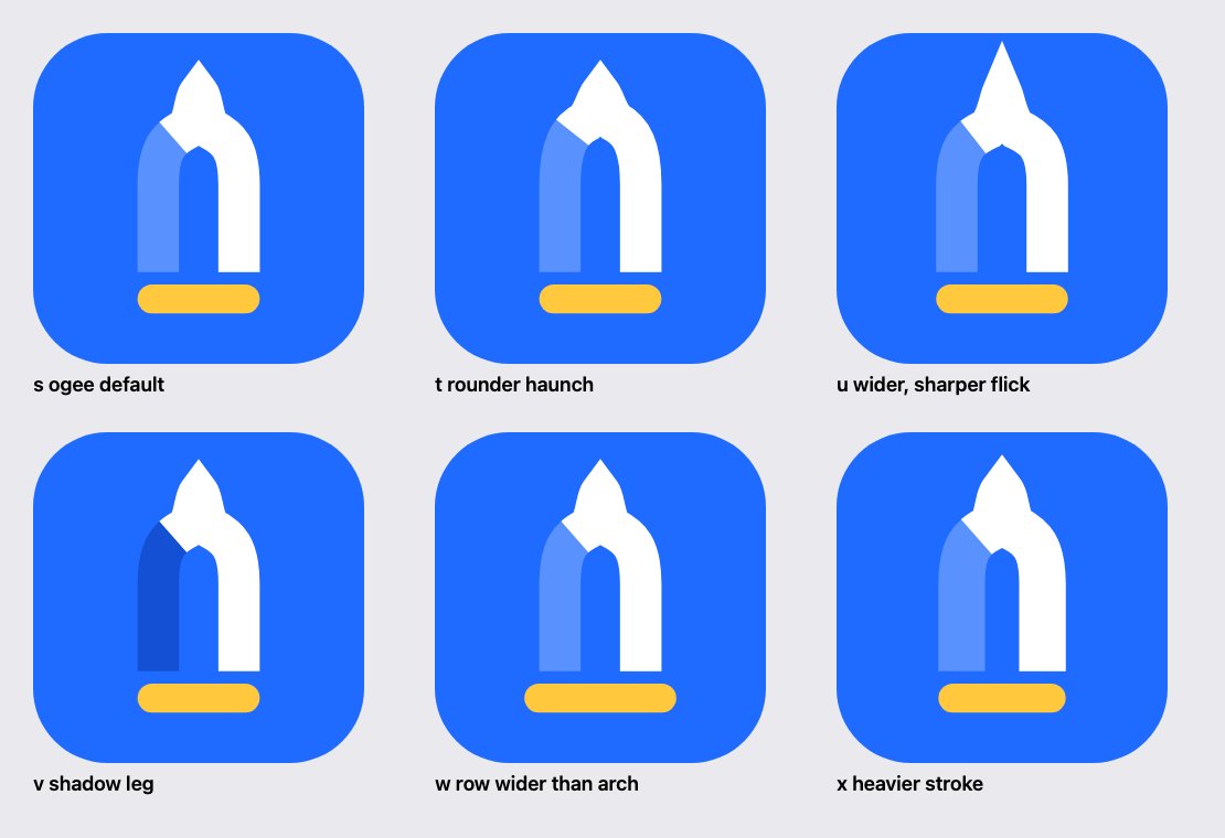
A real mihrab has round shoulders that flick into a fine point. We tried it with thick strokes.
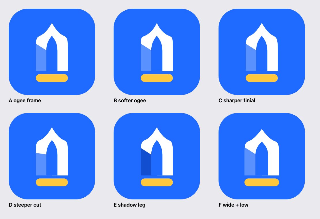
Rebuilt as an ogee outline minus a pointed niche, the way a real frame is made.
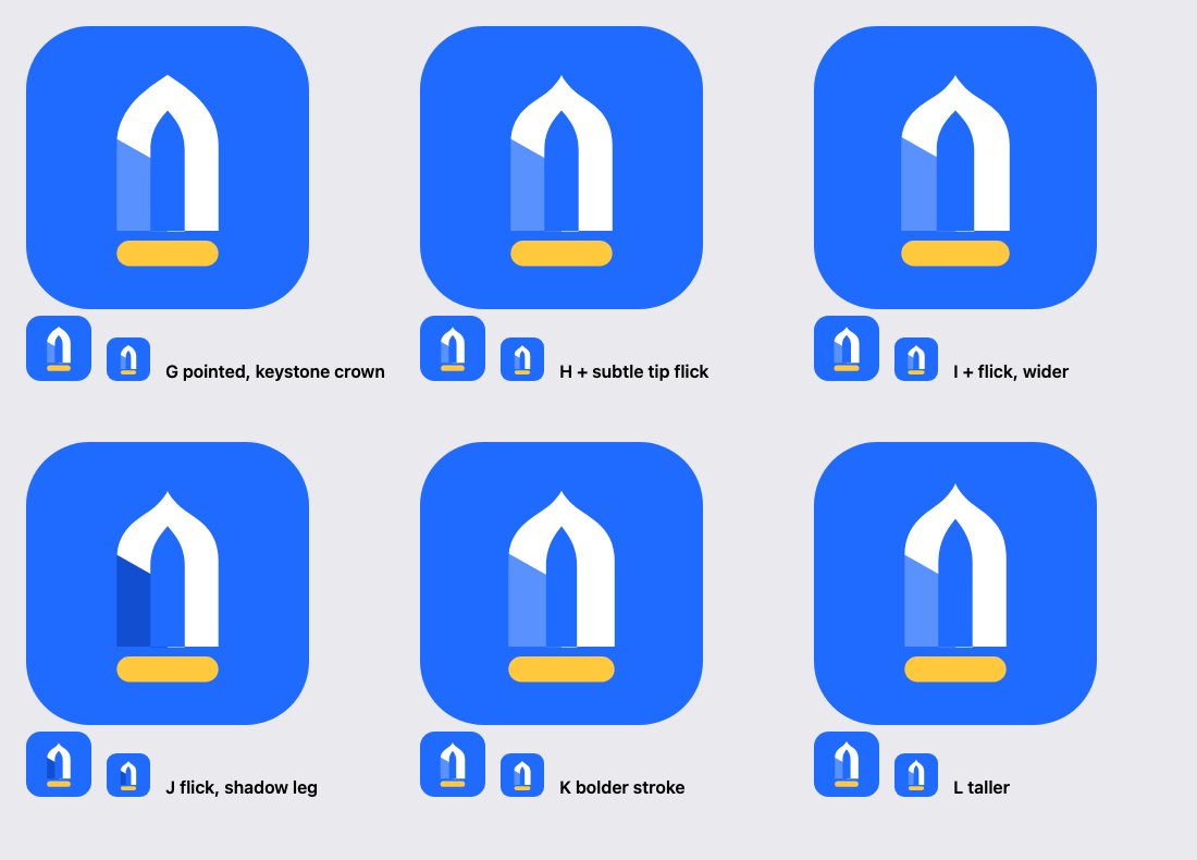
A simple pointed arch for the body, and the ogee only in the last tenth of the tip. Every option was checked at 60 and 40 pixels.
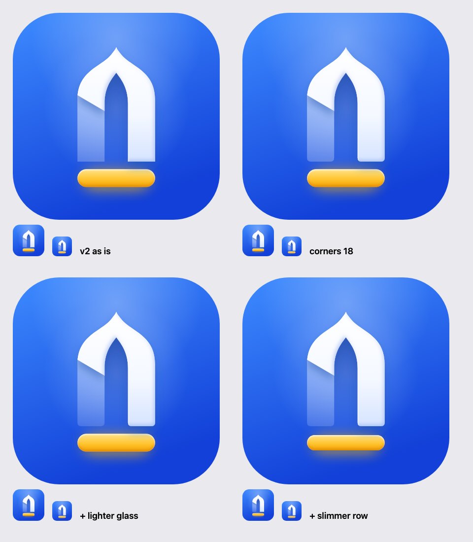
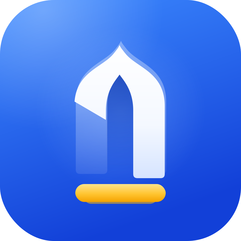
The flat mark became an app icon: a recessed niche, a frosted leg, a raised 1 and a glowing row. Then four refinements side by side.
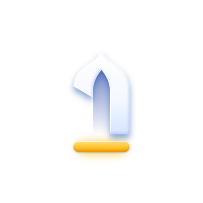
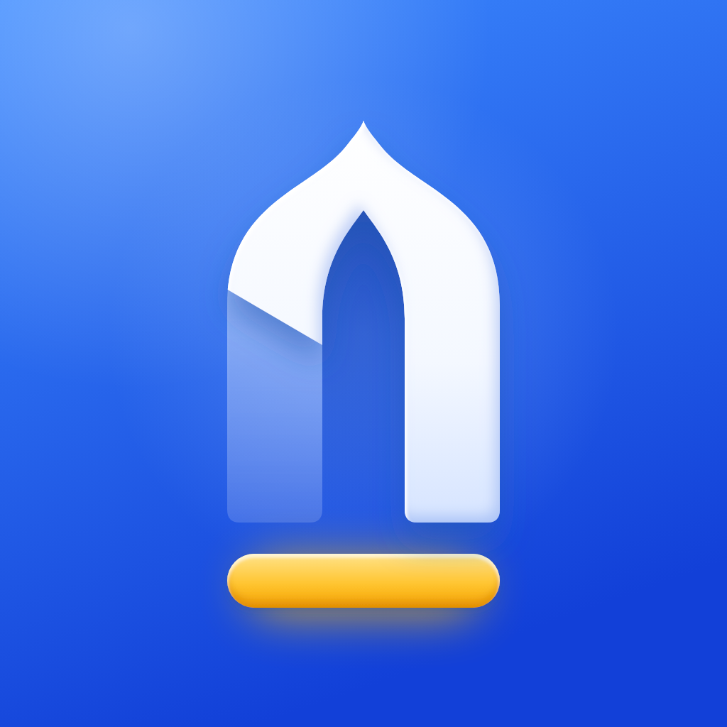
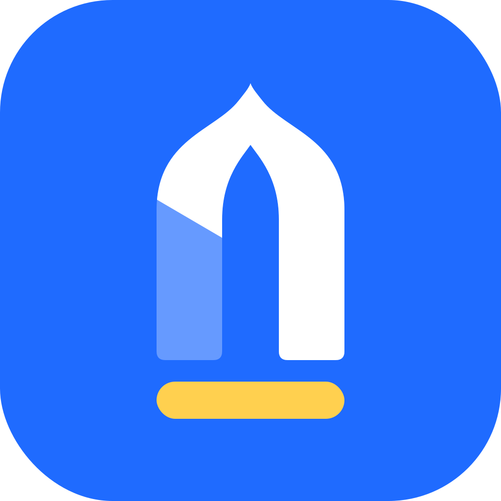
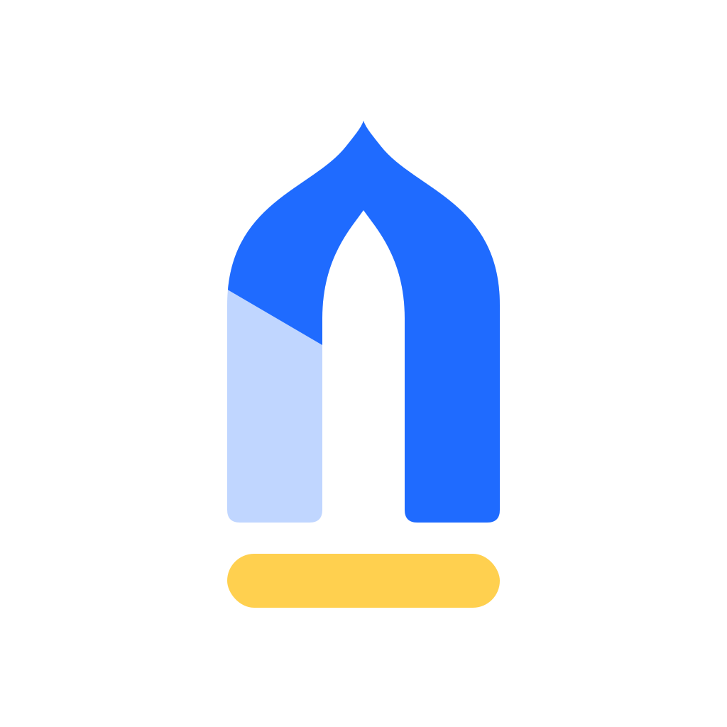
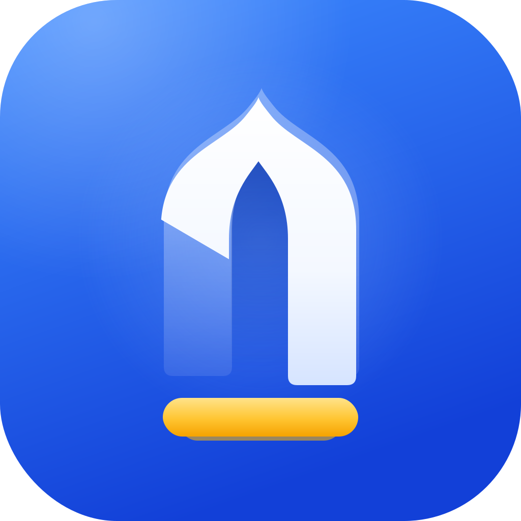
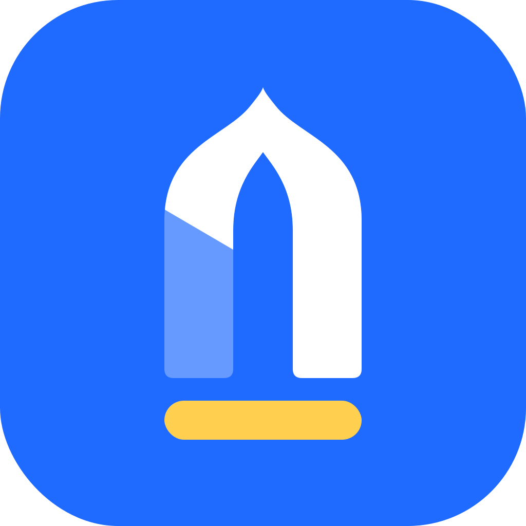
The final mark is a mihrab arch. Its left leg is folded back into glass, so the solid white part is the number one. Under it, as wide as the arch, is the first row in gold.
At the weight we chose, the arch is complete but the 1 is the brightest thing in it. You see the masjid first and the number a moment later.
The mihrab is the niche in the qibla wall. Every masjid has one, from a village room to a grand mosque, and every row lines up in front of it. It is the most universal part of a masjid.
A plain “1” would be a number, not a logo. Hidden in the arch, it becomes the moment people remember: “oh, it's a one.” That is the second reading the board taught us.
In the app, gold already means recognition: levels, the leaderboard, thanks. The first row is an honour, so it gets the honour colour. It is also the one warm thing on a cool tile, so the eye lands there.
The mark is drawn on a 1024-unit canvas with a 64-unit grid. It is built from filled shapes, not lines, so every edge can be controlled exactly.
| Canvas | 1024 × 1024 units on a 64-unit grid |
| Arch width | 384 units, 37.5 % of the canvas |
| Leg width | 134 units, about a third of the arch |
| Crown depth | 126 units, so the stroke feels even all the way round |
| Tip | the last 11 % of the rise turns into a small ogee point |
| Fold | 30° below horizontal, square to the curve it cuts |
| Row | 384 × 76 units: as wide as the arch, 57 % of a leg's thickness |
| Gap | 44 units between the feet and the row |
| Corners | 18-unit radius on the four feet; the tip and the fold stay sharp |
| Balance | 170 units above the tip, 168 below the row: centred to within 2 |
The outer arch, across the feet, and back over the niche is a single closed path. No overlapping edges means no hairline seams at any size.
A full ogee looked like a pagoda. A plain point looked like a pen nib. A plain point with a small ogee flick at the very top reads as a masjid without either problem.
A horizontal cut made a hook. A cut at 30°, square to the curve, makes the flag of a numeral, and it looks like the leg is folded back.
The app icon is flat shapes with light added on top, not a 3D model. That keeps it crisp and consistent with the app's flat glyphs. The light always comes from the top left.
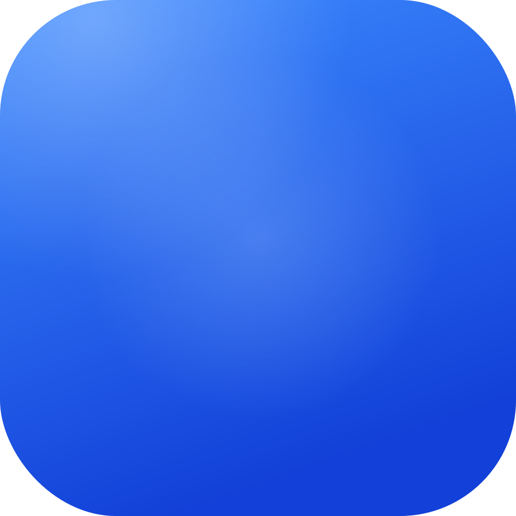

Saff Blue from a lighter #3D8BFF at the top to Deep Blue at the bottom, with a soft sheen in the top-left corner.
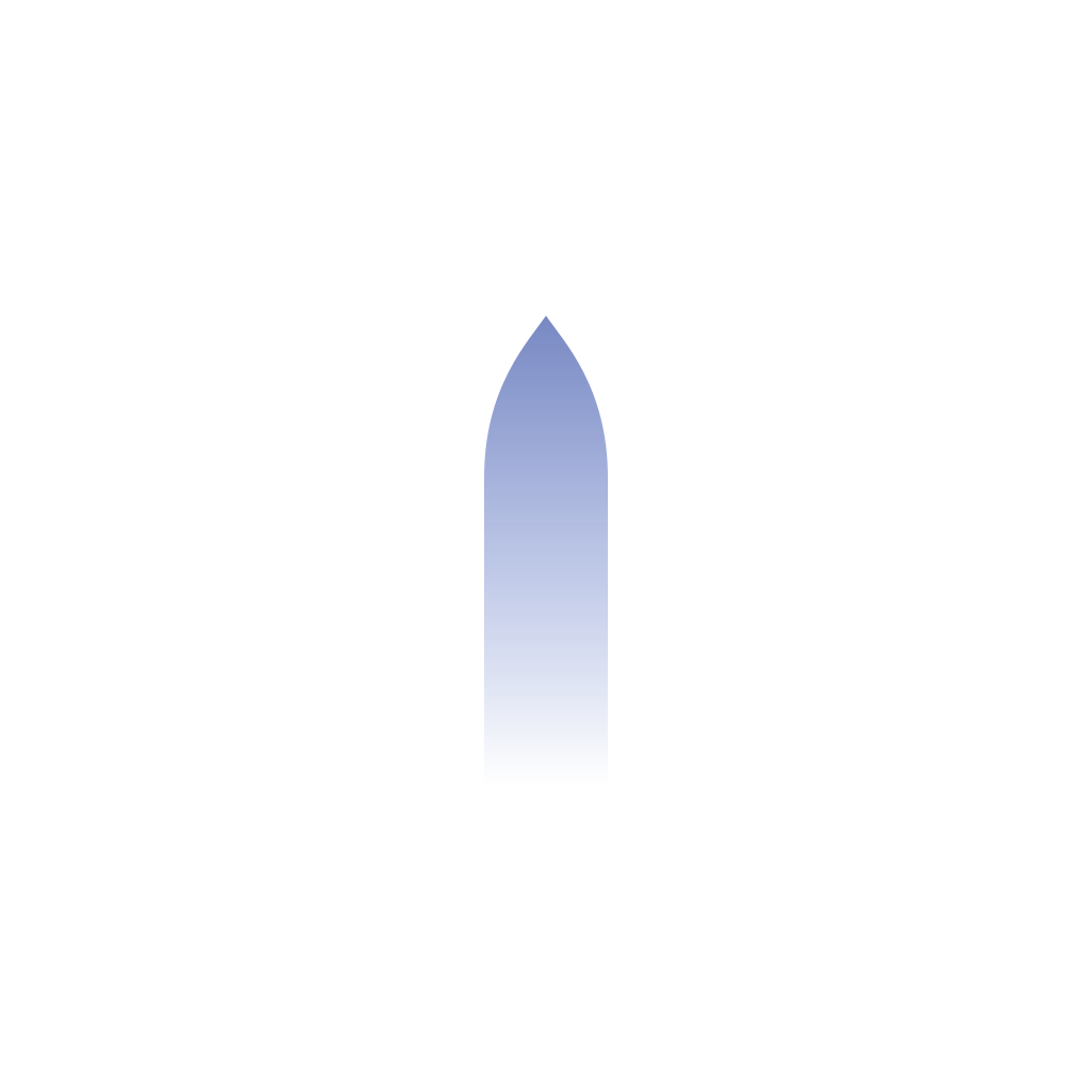
The inside of the arch darkens towards the top, like a real alcove. It makes the arch read as a recess, not a sticker.
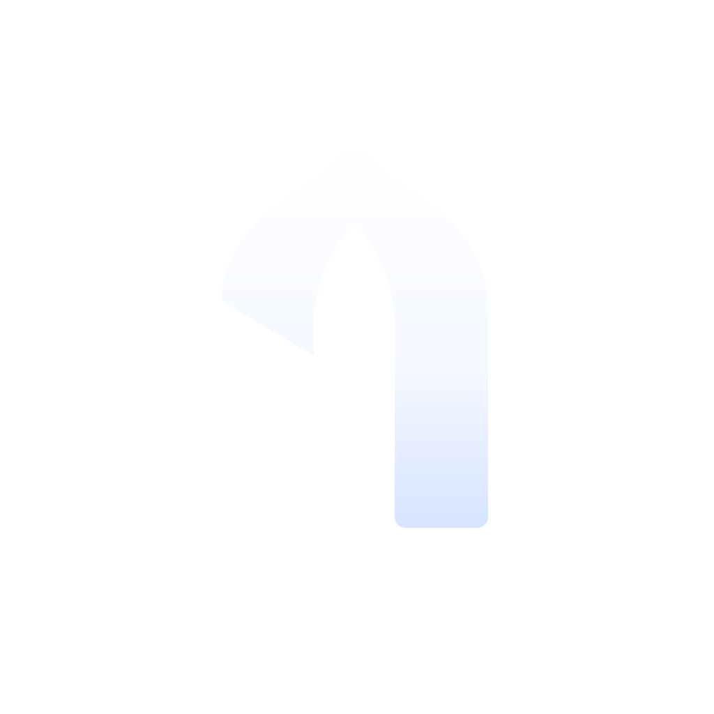
White at 32 % fading to 10 %, with a crisp highlight on its lit edge. It is the same idea as the app's two-tone glyphs, where the second tone is the same colour, lighter.
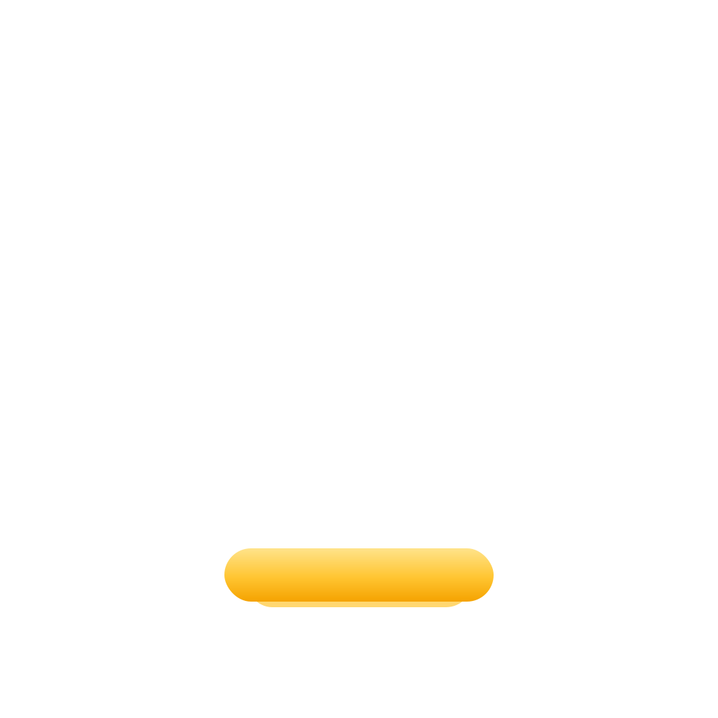
Gold from #FFE38A to #F5A300, a bright top edge, and a warm glow that spills onto the tile below.
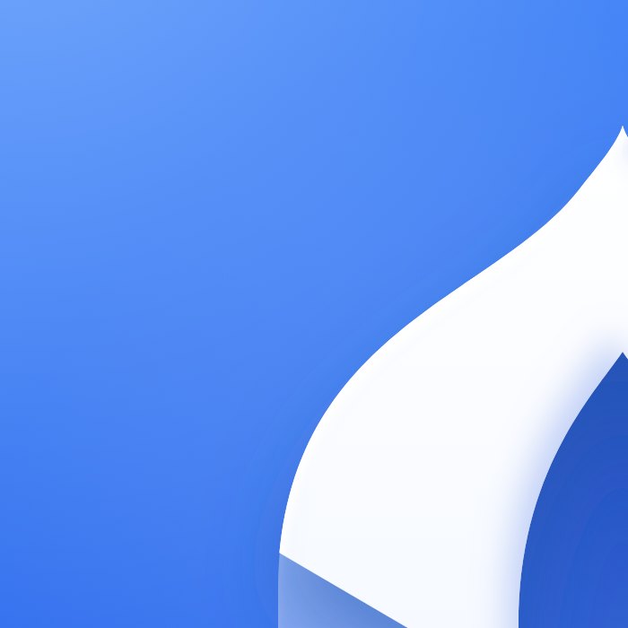
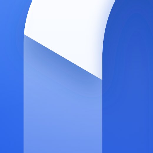
Near-white with a cool blue shade on its lower-right edges and a rim light on the upper left. A soft shadow lifts it off the glass, and you can see that shadow fall across the fold.
Below about 29 pixels, and anywhere effects aren't possible, the mark goes flat. Same shapes, same two-tone rule, no shading.
A logo lives mostly at small sizes, at a glance, on someone else's wallpaper. So we tested it the way people will actually see it.
These are shown at their true size on your screen. 16 px uses the flat version.

Blur the icon until the detail is gone. A strong mark keeps its shape: here you should still see a tall white arch on a gold line.
About 1 in 12 men and 1 in 200 women see colour differently. The mark is built on lightness, not hue, so the 1 and the row stay clear in every case.
Turn everything one colour and the shape alone has to carry it. The arch, the fold and the row are all still there.
WCAG contrast ratios, calculated from the exact colours. Shapes need 3:1, text needs 4.5:1.
The first gold, #FFC23A, measured only 2.8:1 on flat Saff Blue: just under the 3:1 a shape needs. In the 2.5D icon it was fine, because the row sits on the deeper blue at the bottom of the tile (4.6:1). So the flat gold moved to #FFD04F, a touch lighter, and now passes everywhere. The rows above show the new values.
First SaffFirst SaffAndroid crops the icon to whatever shape the phone uses. The mark sits inside the safe zone, so nothing is ever cut.

The palette is the app's palette. Nothing new was invented for the logo, which is why it already feels at home on the map and in the sheets.
Gold works because there is so little of it. Keep it to the row, the dot, and moments of recognition.
The wordmark is set in Anek Latin, the same typeface as every screen of the app. It is narrow, open and slightly square in its curves, which sits naturally beside the arch.
We compared 600, 700 and 800. 600 looked thin beside the icon, 800 crowded the counters. 700 matches the weight of the arch's legs.
The dot of the i sits at exactly the height Anek draws it, but in gold. It is the first row again, tying the word to the mark.
An early version used Inter. It was neat but generic. Anek is ours: it is already on every screen, so the name looks like it belongs to the app.
The mark works alone as the app icon. Next to the name it forms the lockup. Give both room, and leave the drawing alone.
Keep a quarter of the icon's height clear on every side. Nothing else should enter that space.
| App icon, 2.5D | 29 px and up |
| App icon, flat | 16 px and up |
| Lockup | 110 px wide and up |
| Backgrounds | White, light grey, Saff Blue, Night |
The same mark, sized and simplified for each place it appears.
 First Saff
The favicon: the flat mark at 16 pixels in a browser tab.
Vector files for print and web, and the app icon at full size.
 First Saff